Give Your Bookcases Depth
To say I was inspired by this post from Little Green Notebook would be an understatement. It finally gave me the gumption to attempt painting the very shiny backs of my Ikea bookcases.

Do you see how the creases in the back made them look like fake furniture? I mean, I know they are, but we don't have to STARE at the evidence every day. I was hoping a nice flat paint would camouflage it. Flat paint's known for its concealing ability and though it's not easy to wipe clean, I figured the back of a bookcase wouldn't need much of that anyway. I chose the ceramic finish in Grand Distinction paint from Menards, which they claim has "superior scrubbability." Time will tell.

I also picked up a quart of the Zinsser Shellac-base primer that Jenny recommended. With a small paint pan (to roll my small rollers in) my total was $34. I think the primer was $14.99, but I'm not sure. I knew it would be worth it if it worked because I need a good primer to redo the bookcase I took out of Chandler's room. The little quart size should be plenty for both projects. I chose not to tint it (like she did) because I want to use it on a radiator and Cadence's chimney, where I need its stain-blocking attributes. Both of those are white. Supposedly, it even blocks odor, which would be nice on a piece of furniture that has a funky old-house/neglected smell.

Here's the color I picked. I wanted something that gold would look amazing against, so I knew it had to be pretty cool. I may have gone a little far because it sometimes appears blueish - especially in photos. Still, I think it will look great when I get around to adding some gold accents. I had a freak-out moment when I thought it was too dark. I didn't want it to look like I painted them black! But I'm used to freaking out when picking and putting paint colors on, so I just take a breath and keep painting, waiting to pass judgement til I see it dry. That's what I'm doing here.

You must know, I usually look like a hobo when I do projects. This was an unusual day. I believe a project equals permission to let myself go. It seems somehow noble to be unkempt when you're in the process of making something more beautiful. In fact, one day, I couldn't face the task of putting myself together, so I dug out my project clothes and ran around town with paint splatters that said, "Obviously, I'm not trying today. Today's purpose is much bigger than personal hygiene." I'm sure they were all fooled, assuming of course, they all cared. Sheesh...
But I'm getting ahead of myself. I taped the areas I wanted to protect and seriously recommend painting before you assemble if you have that much foresight. Other options that are possible before you assemble, would be wallpapering or simply wrapping each panel with some pretty fabric. If you are, like me, painting pre-assembled areas, use Froggy tape. More on that later...

This stuff isn't like paint in consistency. You need to shake it really well. Otherwise, when you open and try to stir it, it's watery with peanut butter-like stuff in the bottom. So shake it well and then stir. The picture on the left is how it looked mid-priming and the right is after one coat. I'll say, it doesn't seem like it's sticking or covering while you're doing it, but in the end, I think it really did. And it only takes 45 minutes to dry enough to start painting over.
I did two coats of gray and waited for it to dry. Then I started peeling tape. That's when this happened:

This was certainly the worst of it, but corners were terrible. The paint was attached to the tape and when I pulled the tape away, the paint would stretch thin and finally tear. I got pretty mad. Especially when I noticed that the paint had managed to pull the primer off with it. I tried cutting the edge with a razor before pulling the tape, but it didn't seem to do a better job. I just touched up with my kids' watercolor paint brushes. I've heard that Froggy tape is expensive, but doesn't do this. If this is accurate, spend the money. We have quite a few rolls of blue painting tape because every time someone went for paint supplies during our renovation, they came back with another roll. So do you think frugal me could skip using some of that up and try Froggy tape? Let's just say, I can now. The blue tape is now considered masking tape at our house.
It got better when I started arranging books and decorations. Bookshelves are like a puzzle - trying not to get too heavy on one side or accidentally put similar items next to each other. There's quite a bit of switching around before it's all said and done, but well worth the effort. Feel free to turn books on their sides to use as bookends and flip offensive paperbacks around. For you hardcore book-lovers out there, this may seem like blasphemy, but they're still easier to grab than if they were packed away in a box. At least that's what I tell my husband...


I love how all the white items pop now, against the gray. Their shapes and textures were sort of lost against the white. In this shot, you can see my final tip for arranging shelves. When you have books and an item on a shelf, alternate sides that the books are scooted against so the shelves look balanced. And a strategy for decorating with found objects that look orderly and zen, is collect similar objects (like my teapots and the stemmed bowls) from thrifts stores. This gives you a gathered-over-time look that's more pleasing that the I-just-bought-all-my-decor-at-Hobby Lobby. No offense Hobby Lobby, but it feels artificial to me, which isn't relaxing.
Hope this weekend will bring some rest for you, or at least enough of a change of pace to be refreshing.


Do you see how the creases in the back made them look like fake furniture? I mean, I know they are, but we don't have to STARE at the evidence every day. I was hoping a nice flat paint would camouflage it. Flat paint's known for its concealing ability and though it's not easy to wipe clean, I figured the back of a bookcase wouldn't need much of that anyway. I chose the ceramic finish in Grand Distinction paint from Menards, which they claim has "superior scrubbability." Time will tell.

I also picked up a quart of the Zinsser Shellac-base primer that Jenny recommended. With a small paint pan (to roll my small rollers in) my total was $34. I think the primer was $14.99, but I'm not sure. I knew it would be worth it if it worked because I need a good primer to redo the bookcase I took out of Chandler's room. The little quart size should be plenty for both projects. I chose not to tint it (like she did) because I want to use it on a radiator and Cadence's chimney, where I need its stain-blocking attributes. Both of those are white. Supposedly, it even blocks odor, which would be nice on a piece of furniture that has a funky old-house/neglected smell.

Here's the color I picked. I wanted something that gold would look amazing against, so I knew it had to be pretty cool. I may have gone a little far because it sometimes appears blueish - especially in photos. Still, I think it will look great when I get around to adding some gold accents. I had a freak-out moment when I thought it was too dark. I didn't want it to look like I painted them black! But I'm used to freaking out when picking and putting paint colors on, so I just take a breath and keep painting, waiting to pass judgement til I see it dry. That's what I'm doing here.

You must know, I usually look like a hobo when I do projects. This was an unusual day. I believe a project equals permission to let myself go. It seems somehow noble to be unkempt when you're in the process of making something more beautiful. In fact, one day, I couldn't face the task of putting myself together, so I dug out my project clothes and ran around town with paint splatters that said, "Obviously, I'm not trying today. Today's purpose is much bigger than personal hygiene." I'm sure they were all fooled, assuming of course, they all cared. Sheesh...
But I'm getting ahead of myself. I taped the areas I wanted to protect and seriously recommend painting before you assemble if you have that much foresight. Other options that are possible before you assemble, would be wallpapering or simply wrapping each panel with some pretty fabric. If you are, like me, painting pre-assembled areas, use Froggy tape. More on that later...
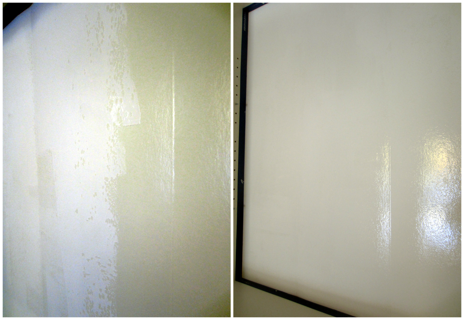
This stuff isn't like paint in consistency. You need to shake it really well. Otherwise, when you open and try to stir it, it's watery with peanut butter-like stuff in the bottom. So shake it well and then stir. The picture on the left is how it looked mid-priming and the right is after one coat. I'll say, it doesn't seem like it's sticking or covering while you're doing it, but in the end, I think it really did. And it only takes 45 minutes to dry enough to start painting over.
I did two coats of gray and waited for it to dry. Then I started peeling tape. That's when this happened:

This was certainly the worst of it, but corners were terrible. The paint was attached to the tape and when I pulled the tape away, the paint would stretch thin and finally tear. I got pretty mad. Especially when I noticed that the paint had managed to pull the primer off with it. I tried cutting the edge with a razor before pulling the tape, but it didn't seem to do a better job. I just touched up with my kids' watercolor paint brushes. I've heard that Froggy tape is expensive, but doesn't do this. If this is accurate, spend the money. We have quite a few rolls of blue painting tape because every time someone went for paint supplies during our renovation, they came back with another roll. So do you think frugal me could skip using some of that up and try Froggy tape? Let's just say, I can now. The blue tape is now considered masking tape at our house.
It got better when I started arranging books and decorations. Bookshelves are like a puzzle - trying not to get too heavy on one side or accidentally put similar items next to each other. There's quite a bit of switching around before it's all said and done, but well worth the effort. Feel free to turn books on their sides to use as bookends and flip offensive paperbacks around. For you hardcore book-lovers out there, this may seem like blasphemy, but they're still easier to grab than if they were packed away in a box. At least that's what I tell my husband...


I love how all the white items pop now, against the gray. Their shapes and textures were sort of lost against the white. In this shot, you can see my final tip for arranging shelves. When you have books and an item on a shelf, alternate sides that the books are scooted against so the shelves look balanced. And a strategy for decorating with found objects that look orderly and zen, is collect similar objects (like my teapots and the stemmed bowls) from thrifts stores. This gives you a gathered-over-time look that's more pleasing that the I-just-bought-all-my-decor-at-Hobby Lobby. No offense Hobby Lobby, but it feels artificial to me, which isn't relaxing.
Hope this weekend will bring some rest for you, or at least enough of a change of pace to be refreshing.


Hi Kendra,
ReplyDeletethanks for this great - and helpful post! And now I also know that the back is grey and not blue as I thought ;-). Good job!
Yes - but you're right! It looks blue in pics :)
Delete